Showing posts with label painting. Show all posts

Tuesday, March 31, 2020

Careful What You Wish For

"Mooove Back!" (pastel, 16x8 inches)

Our times have changed so dramatically in such a short time. Just two months ago I was sketching portraits for my 25th year at the San Antonio Rodeo, surrounded by hoards of people (well, on Saturdays at least!) Then I woke up one day in March and it seemed as if my entire calendar for the foreseeable future was wiped clean.

For the first couple days of cancellations, I was frankly shocked and a little depressed, wondering where my income would come from. But at heart I've always been one to take life as it comes and follow the opportunities that life presents to me. An idea from another artist prompted me to have a Studio Sale, which has been quite successful thanks to my wonderfully supportive clients! (You know who you are, and Thank You!)

In week 2 and 3 of these strange isolated days, the new reality has begun to settle in, and I've been seeing this as a golden opportunity to handle those critical actions that have constantly been pushed to the bottom of the to-do list since 2016... namely CLEAN UP THE COMPUTER, and the surrounding office! 😂 (and next.... the Master Closet!?)

But humming just beneath the surface of all this domestic activity is the strong, pervasive desire that has been plucking at my mind for months, digging it's way through the frustrations of juggling several businesses and scheduling conflicts. That little voice is telling me "I just want to be a Daily Painter!" In the tradition of Julian Merrow-Smith, Dwayne Kaiser and Carol Marine.......... Drop the events, the craft shows, the festivals... I just want to paint, and post, and see where that leads.

(I've been half-heartedly attempting to paint daily since 2011, but my average has dropped off. Sure, the unwritten "rules" of Daily Painting are not as firmly followed as in the early years of the movement. Even the big names don't paint/post EVERY day any more. But most of them did - for years!)

So the little voice is saying "..What are you waiting for? We've cleared your schedule... "

I'm filled with sadness and regret that it has taken a global pandemic to finally bring this little voice to the forefront. But that just firms my resolve to make this opportunity worth the effort. I'll be taking this adventure one day at a time, and we'll see how far it goes.

I sincerely hope you have not had any friends or loved ones severely affected by this virus. How have the forced stay-at-home rules and the changed situations affected your daily life and your future goals?

Today is Day 1 of April. I invite you to follow along with my journey and I'd love to hear from you!

Follow my Daily Paintings

Sunday, June 3, 2018

Background Binds (What to Do?)

"Mondo" with photo reference

I recently had an inquiry from a friend about what do do with backgrounds.

Hi Rita, 
I just discovered your art recently and I love the colors and the expressions of your animals, just beautiful. I am struggling to learn to paint in pastels myself, and deciding when to use which color is especially difficult for me. I was wondering how you determine which colors to use in your backgrounds for your animal portraits, do you have any tips?


Color is a complicated question, and one that I've learned is answered best by "value and temperature." I recently wrote an article on my Art Journal Blog about this, see here: http://ritakirkmanjournal.blogspot.com/2014/11/value-and-temperature-or-how-do-i.html

Backgrounds can sometimes present the greatest challenge in a painting. Especially when the painting is of a recognizable subject that holds its own as a center of interest and is easy enough to paint using a reference. But what about when your subject is surrounded by other objects that you don't want to include?

Sometimes, in my reference photo, I find that the background is perfectly lovely and I want to paint it exactly how I see it (..This doesn't happen very often!!) Usually, I have to use artistic license:

"Azul" with photo reference
I usually ask myself when I'm building up my under painting, "Do I want this subject to stand out boldly from the background, or do I want it to harmonize subtly with the background and the painting as a whole?"

If I want to be bold I use contrasting values. (dark behind the light parts and light behind the dark parts.)
"Bianca" and "Inky"

If I want to be subtle and harmonious (a more recent goal of mine,) I try for analogous colors and very close values from subject to background:

"Paella" and "Mr. Frost"
And usually, my subjects are outdoors, so in what I call my simple "default" background, I habitually use the standard laws of atmospheric perspective, and use cooler (and sometimes lighter and/or more neutral) colors in the far background, and warmer landscape colors in the closer background:


I've also gotten into the habit of keeping the backgrounds "fuzzy", meaning no crisp edges anywhere in the background. This helps with the feeling of  a soft focus that sets off the subject by contrast, and remains "farther away."

As a last point,always try to use some of the same colors in your background as in your subject. This will help assure color harmony, no matter which other value contrasts you're aiming for.

After a while, you'll learn how to completely ignore what's in your image background, and create a background that will best support your star subject!

(Personally, larger compositions have tended to give me the most background troubles. If you'd like to read more about my struggles with backgrounds, here's a perfect example from a while back. I wrote about "Leader of the Pack", in two posts:
http://ritakirkman.blogspot.com/2010/08/newest-cow-painting-progression-photos.html
and
http://ritakirkman.blogspot.com/2010/10/leader-of-pack-finally-really-finished.html)

"Leader of the Pack" (2010, pastel, 32x32 inches) first finish and final finish

Thanks for reading! I'd love to hear from you if you found this helpful!

 .

Thursday, September 1, 2016

Scan Pastel Paintings for Better Prints

A recent question from an artist friend asked about how I get good image files for making prints:

"I wanted to tell you that I think your art is beautiful and inspiring. I work with pastels also. May I ask you a question: If you do giclees, what is the best way? Is there such a thing as scanning the art, do you take a photo?"
Here's my answer (with a few revisions to make a better blog post!)

Yes! Scan it!
I do scan all my artwork, whether I make prints or not, so that I have an accurate, high-resolution image file for my records. I highly recommend scanning artwork (and pastel is perfectly fine being placed down on the glass.) My current scanner is an Epson V700; it's been the best one I've had so far, and has lasted the longest.
Scanning small works are easy, as they fit well in the scan bed:


I've also learned not to be TOO picky with getting an exact color match on the print (I had a cheap little hp scanner years ago that really captured exact color - except couldn't separate the very darkest values [has to do with D-Max rating]) Every scanner will be a little different and you just get used to learning how to get the best out of it. This Epson came with Silverfast SE software which I really like.

Scan vs. Photo 

Sometimes I will just photograph a painting if I'm away from home and need a quick post. The best way, in my opinion, to photograph artwork (if, like me, you don't have all the expensive photography lights and meters to balance everything perfectly) is to set the painting on a shady porch in daylight and, standing right over it, aim straight down with your camera and zoom in to just around the painting, making sure the edges are squared with your viewfinder. (If the painting is too large to stand over, lean it against the house instead.)
Cameras with better lenses will capture better quality images of your art, but there can be variations in temperature that are hard to manage without professional lighting and know-how. And, in my own experience, the clarity and crispness of the tiny details always seems to fall short through a camera (at least with pastel anyway.) Usually, a good camera photo will be sufficient for an image posted online, what with all the variances in other people's monitors anyway, but I really prefer a scan when I want to make a print.
To show you an example of a painting that I photographed and also scanned, here's "BFF" (16x16 in.) in both images. The slightly warmer image on the left was from the photo. The other is much more accurate tone and clarity (scanned.)
This is even more noticeable at full resolution, which you can see in the cropped images below (click and zoom in for a better comparison.)

Large Pastels on Small Scanner?
And yes, the scanner is just a normal desktop size, but with larger work I scan in sections and splice it together in Photoshop. I actually lay the scanner on the floor, move the painting carefully between scans without dragging, and wipe off the glass every few scans. (A heavy book comes in handy when weighting edges and corners to keep the large painting on the scanner bed.) It is labor intensive but still MUCH cheaper than going somewhere that has one of those huge flatbed scan things. (It's also much easier when working on a stable surface like gatorboard or some other board. A large work on paper would really need to be mounted on a firm surface to keep it flat over the scanner.)
Here is what one of my large paintings look like right after I scan it, and before it's put together. Each of the separate parts is one scanned area. In Photoshop this would be 16 separate layers.
The extra section with the nibbling ear is the first section I scanned. I always start with an area that has the highest contrast so that the scanner can get the greatest range of lights and darks accurately metered. I also overlap each section to give myself leeway when assembling the whole. (And also because when the painting is face down on a scan bed, it's hard to see where its scanning! So I move it in short increments to be doubly sure I'm not missing any parts.)
Then, after it's all put together (that might be info for another post...) ...Voila! A 300dpi full-sized image ready to print.

Saturday, October 17, 2015

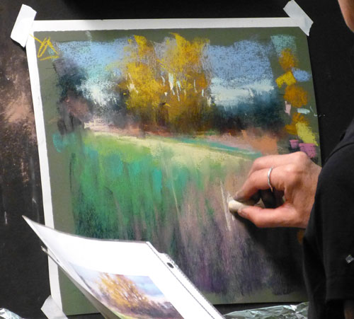
Barbara Jaenicke demo


This weekend I'm fortunate to be taking a workshop from artist Barbara Jaenicke, at the Coppini Academy of Art in San Antonio. I absolutely LOVE her landscapes! Click on her name to visit her website!
She first does a thumbnail sketch from her photo, to nail down the basic value patterns, then does an underpainting with pastel washed in with isopropyl alcohol.

These are just a very few of the photos that I took. but she worked so sparingly that most of the pics I took didn't seem to show much progress, but somehow, magically, the painting got finished!

These are the colors she used for the underpainting...


She washed in the underpainting with  isopropyl alcohol.


She tested what colors she would likely use in the painting, and then got right to it!


My painting for today was from a photo taken at my home town Landa Park, and it looks pretty good in my camera, and others in the workshop liked it, but I don't feel like it's done so I'm not going to show it yet. Maybe tomorrow.

Wednesday, June 17, 2015

3 Marla Baggetta Workshop Demos at IAPS 2015

Sunday June 7, the final day of the IAPS pastel convention, I had Marla Baggetta's one-day workshop. I had seen a painting of her's at the 2011 IAPS pastel exhibit and wanted to learn from her ever since! Marla is well known for her series of 100 variations of the same landscape (done on a dare, she says!)  Well, what an incredible learning tool that is! In her workshop she demoed another landscape done with three different preparations. The first one was direct on a solid ground (paper). The other two had quite different underpaintings.

 She starts her paintings with simple thumbnail breakdowns of the basic shapes and values. Then chooses the size and shape she wants for the scene. (These thumbnails were for a different painting, but you get the idea..)


Demo #1 (on Art Spectrum Colorfix paper I think..)


 This second demo had a "notan" underpainting of graphite washed in with alcohol.


Demo #2

 Demo #3 started with a vivid watercolor underpainting. (#2 and #3 are on Wallis Professional paper - yes, the old good stuff! Marla very graciously had some sheets that she offered to the workshop students for their paintings that day if they wished..)


Demo #3
It was amazing to see how very different the three paintings came out. But she was using the same reference photo for all three!

Here are some of her handy teaching tools; color scheme charts and tiny sample landscapes painted only with the colors shown on the swatches...


Lastly, a glimpse of the back table and some of the paintings she had for sale!

I bought one of her smaller paintings. This one's about 9x5 inches. Dreamy!
Related Posts Plugin for WordPress, Blogger...