Travel Day
Well, another IAPS (International Association of Pastel Societies) Convention has come and gone. It's already been three weeks though it feels like just yesterday. I was privileged to be asked by Mary Lopez, president of the Texas Pastel Society, to be her rep for TxPS and to let her know how it all went. So here I am at another airport on my way to Williamsburg, VA (another story) getting the beginnings of this recollection on paper, and feeling the deja vu of my trip to Albuquerque.
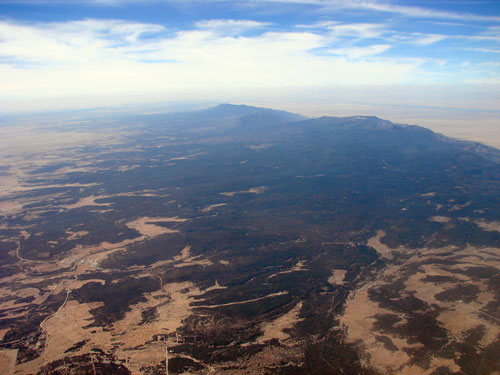 |
| Sandia Mountains |


The Hotel
The Convention was moved to the Hotel Albuquerque in '09. It's an ideal setting for an artists' convention. It's a lovely old hotel on the edge of historic Old Town. It perfectly combines an extensive convention center with a charming hotel steeped in old southwest style and grace. All the rooms even had balconies. We had a great view from the 10th floor.

The Exhibits
Wednesday evening was the opening reception for the 18th Juried Exhibition and the First Master Circle Exhibition, both shown conveniently in conjunction with the 9th biennial convention.
(On the shuttle to the reception, Jeannette and I were each surprised and pleased to be recognized by one of the artists in the show, Tatijana Jacenkew, who had seen our works online. It was almost like being famous!)
The Hispanic Arts Gallery at the New Mexico State Fairgrounds, host to the IAPS exhibits this year, is spacious and beautiful, with various rooms that open into each other. The juried exhibit was in the large front area, separated from the MC exhibit by the Juror's Wall.
 I was thrilled, of course, to see my work hanging on that juror's wall, right between Desond O'Hagan's and Liz Haywood-Sulivan's.
In spite of a problem with the air conditioning which had the building feeling like a large tent in the desert, the reception was very well attended. The building filled up fast. The food was delicious, but the most popular refreshment was the bottled water!
The IAPS exhibit was inspiring. Judge Liz Haywood-Sullivan declared it the finest collection of pastel works IAPS has ever shown. They had almost twice the submissions of previous exhibits. I'd love to review all the winners here, but have to admit I missed most of the awards announcements, being distracted by the show! Besides, you can see them all HERE. Instead, let me mention a few of my personal favorites (in no particular order):
 |
| "Footsteps #9" by Linda Gross Brown |
 |
| "Which Way is Up?" by Robert Carsten |
 |
| "Gypsy Ragamuffin" by Mimi Jungbluth |

 |
| "Nina" by Diana DeSantis |
But no reproduced image can compare to seeing this painting in reality. Ms. DeSantis truly has that indefinable something that grips a viewer and pulls one into a visceral communion that is difficult to put into words.
In "Nina" you can see evidence of the live painting process in subtle lines beside the profile.
The posture breathes.
The hands alone held my attention for several minutes.
 |
| "Pools" by Willo Balfrey |
"Pools" by Willo Balfrey lacks the physical texture of Sargent's oil painting, but has the visual texture and wonderful abstraction of color and strokes that when standing close to it, the viewer looses the scene in fascination of the pastel itself.
 And all of these were just in the juried exhibit! I'd be writing far too long were I to describe all my best impressions from the MC exhibit, but one painting that, for me, stood out from the others (besides Cuong Nguyen's Prix de Pastel winner) was Sally Strand's "Looking Back" (also the Silver Award winner.) It has the painterly strokes and spontaneous color that gives it the look of having been done from life, quickly, almost casually, but on further observation one sees that the arrangement of lines and elements - the window edge, her striped pants, the shoulder strap, even the handbag half out of the picture, and of course, her gaze in the mirror - all play to lead your eye around and around and prevent you from leaving any time soon. In addition, the values and colors are strategically balanced to support this journey and strengthen the composition. The darkest elements, her hair, the bag, the bracelets, and her shirt - especially in the mirror - keep the eye moving in a bouncing diagonal pattern over the scene. And what a scene! Curious, ambiguous, entrancing! There's a story here that the artist graciously allows the viewer to invent.
You can view all the MC Exhibit winners HERE.
The Pre-Convention Workshop
Wednesday and Thursday were the pre-convention workshops. If I could have split myself in two, I'd have taken both Richard McKinley's and Desmond O'Hagan's, but since I had to choose, I took Richard's. It was inspiring and fun as usual. His focus for this workshop was underpaintings.
He first showed us how using watercolor or oil to underpaint is really no different than washing pastel pigment into the paper with water or with mineral spirits. It's just pigment and medium after all. He then demonstrated the three underpaintings that we would learn during the workshop.
The first was "Notan" (a Japanese term revived by Kim Lordier referring to a monochromatic value study) washed into Wallis paper with alcohol. McKinley was excited to show us this particular method because the new binder in Wallis paper is softened by alcohol - allowing the notan to become embedded into the paper and when dry, immovable by either water or mineral spirits. Then, on top of this value study, a layer of transparent colors can be painted with watercolors or oils, creating a new and different underpainting effect.
 |
| preliminary sketch |
 |
| the Notan, washed with alcohol |
 |
| watercolor layered over Notan |

 |
| the watercolor underpainting |

 |
| the oil underpainting |


For all three demos he worked from a photo, and a field study, of the scene. Here's the field study:
 |
| plein aire field study |
The Paint-Around
Thursday evening was the Paint-Around.

 |
| Maggie Price |
 | ||
| Urania Christy Tarbet |
 | ||||
| Jamie Markle |
 |
| Liz Haywood-Sullivan |
 |
| ...and Fred Somers |
If you've never seen a Paint-Around, you're missing out on some excellent entertainment! 5 artists each begin a painting, then every 15 minutes they all rotate to the next easel. ..Yep, you can picture it! 90 minutes later they're all back at their original paintings, fixing - er, that is, finishing up the last deatils. All of the artists sign each painting. The 5 paintings are then auctioned off to benefit the IAPS/UCT scholarship fund.
(Richard McKinley was chosen by Maggie Price to be the auctioneer at Saturday's banquet. Richard - ever the jokester - relayed his call from Maggie. "She said 'We wanted a comedian and immediately I thought of you!'" He was amusing, and it was fun and he got good prices for all of them.)
The Candy Shoppe!
Friday morning, everyone's favorite part of the convention opened -- yes, the "Candy Shoppe"! I vowed before I went that there was really nothing I needed to buy, but I did succumb to a pack of Art Spectrum Pastelmat and a few of Jack Richeson's boards in various colors. But NO pastels! I was firm! ...At least until late Sunday, when I saw the 100 half-stick set of Schmincke at a special discount. ( ...Well, I have just about every brand made except for Schmincke and Roche, and my budget won't stretch to Roche yet...)
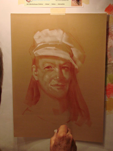
Anyway, for me the better part of the candy shop was the demos - and one in particular - Leslie B. DeMille had an easel in the My Art Tutor booth. Friday afternoon I caught him getting ready to start a portrait sketch with conte sticks on velour paper:


The Margaret Dyer Seminar
My most memorable seminar of the weekend was Margaret Dyer's on Friday morning. She talked about her method of conducting figure (not portrait) commissions, and then showed us, with a live model, how she photographs her client. She brought her own lamp with a 250w tungsten bulb and set it up with a chair in the corner between the door to the hall, and another door to outside. Wonderful combinations of light! When she was done, she showed us her pics on a projector, then - best yet - gave all of us 15 minutes to photograph the model for a $5 tip!
Here are some of my favorites. Very Margaret Dyer-ish. One was just blurry enough to already look like a painting.

You can see some other artists gathered around with their cameras.
Here's Margaret's arm tipping the light to a more dramatic angle for us.

Kim Lordier Hands-On Demo
After lunch I had a hands-on demo with Kim Lordier. The 'hands-on' demos were added to IAPS in '09. These demos focus on a specific concept involved in the painting process. Participants are not expected to create a finished work but instead concentrate on learning or improving one part of the process, all working from the same reference. The best part is all supplies are provided! (12 Terry Ludwig pastels, and more!)
 Kim's demo was on atmospheric perspective. I really looked forward to this demo after hearing Richard McKinley's frequent praises of Kim's skill. Kim had this pre-prepared demo displayed as a visual guide along with the photo reference (at right): From the back of the room this looked like a detailed painting; only up close could one see how loose and unfinished it was! This really impressed upon me how the strength and power of a painting relies on accurate values and temperatures; it's not in the details!
She then showed us each step of the way and had us work along with her, building our values and temperatures to create convincing atmospheric perspective.
 |
| initial sketch |
 |
| the "Notan" |
 |
| cool and warm darks |
 |
| warm lights in forground |
 |
| cool lights in background, progressing from turquoise to violet |
The President's Dinner
Friday evening was the President's Dinner. (Thank you, Mary, for referring me - the food was delicious, especially desert!) Friend and fellow artist Sonja Kever was also there representing the Austin Pastel Society. We sat with some ladies form the New England area and had some good conversation.
I had asked Sonja if I could borrow her notes on the dinner presentation (I'm not a note-taker!) but of course I never did get around to it. The main point made by IAPS President Maggie Price was that we will have the Hotel Albuquerque for the 2013 convention locked in at the current prices She made many other good points in favor of not moving the convention to another city, and convinced all of us that it had nothing to do with it being in her own back yard (lol!) (Peggy Breutigam paraphrases it very well HERE) One impressive point I remember is that the convention attendance this year nearly doubled from '09 and filled the entire hotel, overflowing to a nearby Best Western.
An important topic presented by IAPS V.P. Liz Haywood-Sullivan was on the ASTM-4236 and the development of a lightfastness standard for pastels.
The ASTM-4236 is the Standard Practice for Labeling Art Materials for Chronic Health Hazards, and this article from NaturalPigments.com explains it very well.
This blog post by artist and writer Katherine Tyrrell writes a comprehensive and fascinating update on the development of a lightfastness standard for pastels.
SmART Business Seminar
My Saturday classes were spent entirely with Liz Haywood-Sullivan. In the morning was her SmART Business Seminar: marketing advice for the pastel artist. She covered a ton of information in two short hours: Evaluating your artwork, promotion, pricing, shows, competitions, galleries, getting published, and more. Some of this was familiar to me from experience and from similar seminars.
What stuck in my mind the most was the idea of having a definite long-term (10 years, etc) immovable goal for your art career, and by getting there through series of short term and intermediate goals which lead one always toward the end goal. The intermediate goals remain flexible and may change depending on available opportunities and other life factors, but the long term goal never wavers, and the short term goals (1 year or less) don't change either once you commit to them. All career decisions should be made with the final long term goal in mind. This is the system that Liz uses and she admitted to us that even her participation in IAPS and her volunteering with ASTM have steps toward her long-term goal.
The importrant thing for each of us as artists, of course, is to figure out what our own long-term goal is.
(This is delicious food for thought. I'm not sure I agree with this long-term goal concept 100%, but tis is the part of her seminar I remember most so it definitely struck a chord. I may think on this and spout another journal post at some future date with my own career philosophy.)
Painting the Dramatic Sky
 Saturday afternoon was Liz's hands-on demo. The best part of this for me was seeing the way she uses bold, wide strokes to lay in the main colors and values. We worked large on a simple southwest scene of land and sky.
After washing in this underpainting with alcohol, she guided us through how she layers on the colors, gradually progressing to smaller detail in the land and clouds. Special emphasis was placed on the proper value scale of the blue sky, and she showed us with another diagram how perspective and distance from the horizon affects cloud shape and temperature...


Banquet Keynote Speaker and Presentation
 I almost didn't go to the Saturday banquet, but decided to purchase a ticket when I found out they keep a few 'plates' in reserve for latecomers. I'm glad I did! Kate Hersey of Unison pastels gave the Keynote presentation and an inspiring slide show about the history and manufacturing process of these luscious pastels. Hand-made by less than a dozen employees, the 'factory' is a charming old stone coach house in Northumberland, England. In spite of the death of John Hersey, and various economic pressures, these pastels are still made to the same exacting standards as when they first came on the market in the early 1980's.
www.unisoncolour.co.uk
Time Off...
 Sunday morning was my half-day off. I was ready for some down time to relax my brain, away from what was rapidly becoming visual overload. So where did I go? The Botanical Gardens of course, with camera in hand, to capture some visual overload of a different kind! Here are just a handful of the 200+ shots I got that morning...

 |
| ...imcluding the most prolific collection of (very hungry!) koi I'd ever seen |
Fish, Fronds, Falls and All!
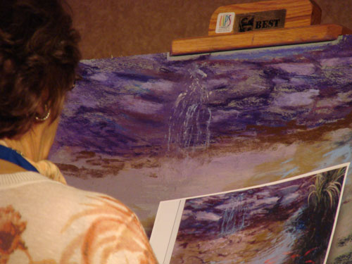
Speaking of koi,that afternoon I got to see Rae Smith at work on one of her famous koi ponds. She worked off of a photo of another of her paintings. She made it look so easy! It was wonderful to see Rae's rambling, skumbled lines, after so many painterly techniques. Her style, almost more drawing than painting, really speaks to my artistic instinct.


"Pastel Pics" Silent Auction
Saturday at 4pm, the Pastel Pics silent auction closed. By Sunday morning at 11, they were ready for the artists to sign and the winners to pick up! The "Pastel Pics" event was new to IAPS this year. The IAPS Demonstrators and Master Circle artists were approached for donations of one small original pastel painting, unframed and... unsigned! Read here for more ...
I had checked out the collection on Friday and bid on several, expecting to be outbid (which I was.) Saturday I took my time and deliberated carefully about which one I wanted that I could still afford. (The obvious Cuong Nguyen donation having been bid way up!)

 I decided to bid again on my first favorite, which turned out to be Terri Ford's (at right):
 Then in the final minutes was pulled by the excitement to bid on another beauty that only had one bid so far! I couldn't resist those clouds! This one was by Sharon Will.

 Here was my contribution, called "Safety Net." I was just a little miffed that it only had 2 bids(!) but I did receive a commission for a similar piece by an artist who loved it but missed out on the final bidding. That definitely made me feel better (lol.)
(I took shots of all of the "Pastel Pics"on Sunday, and will attach them all on my next post, so you all can see what you missed out on! -- Or maybe you didn't?)
I had another bit of excitement while waiting for the end of the bidding, when a woman came up to shake my hand and said "Rita Kirkman? Hi I'm Sally - I want to tell you how much I admire your work, I saw your two portraits in the show." A glance at her name tag revealed her to be "...Sally ...Strand! Wow!" I replied, "I love your work!"
It was a memorable moment!
The Post-Convention Workshop
By Monday morning the hotel was emptying fast, but there were a few of us left for Margaret Evan's plein aire workshop in the Sandia foothills. I had been waiting four years to get back to that location! It wasn't quite the same with out Maggie Price, but Margaret was charming and a pleasure to listen to (she's Scottish) and I learned a lot form her ability to adjust the landscape to suit her painting. (Too many rocks? Leave some out. Pathway too flat? Angle it!) You can see her first demo HERE.
Margaret also had us return to the hotel for your critiques in the afternoons. Getting the paintings out of their environment, she says, is important in allowing the paintings to stand alone as artwork where your eye can't instantly compare them to the reality of the landscape. It really works!
 I especially admired the work of Australian artist Lyn Diefenbach, who I met at IAPS in '07 in Maggie Price's workshop. She's known for her incredibly detailed large florals but has such a fresh, loose (and fast!) plein aire sketch. She had to travel on Tuesday, so Monday she cracked out 4 paintings! here's my favorite of hers:
The End (Or The Beginning...)
There was so much to take in at IAPS '11 that by the end I felt overwhelmed, and vowed that next time I'll just pick one instructor and take all that they offer and leave the rest of the weekend for, well, resting.
...But probably I won't be able to resist scheduling just one more demo, ...then just one more seminar, ...and Oh, I won't want to miss that one!
...It's a lot like trying to resist those irresistible pastels themselves!
Until next time -- happy pastelling!
 |
| "I flew so high, the earth was round" |